Get your coffee-table art and design book fix

Roula Khalaf, Editor of the FT, selects her favourite stories in this weekly newsletter.
Portraits of Baptist churchgoers form part of a book exploring black cultural identities

Photographer Dario Calmese was at an Abyssinian Baptist Church service looking for hats to photograph when he first saw the vintage fashion collector Lana Turner. Struck by her style and poise, he decided to make Turner his sole subject instead. The resulting photographs, taken between 2012 and 2016, now form part of As We See It, a new book that brings together 30 artists, including Campbell Addy and Nadine Ijewere, who are interested in exploring different narratives around black cultural identities.
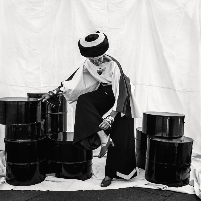
For the series, Calmese styled and photographed Turner in her own collection of silk brocade gowns, vintage furs and leather gloves. By focusing on the cut of a trouser leg, the curve of the waist or the fall of a sleeve, Calmese evokes Dior’s hyper-feminine midcentury New Look – working to “repopulate the landscape of black imagery and understanding that’s been told to us”, he writes.
As We See It: Artists Redefining Black Identity by Aida Amoako is published by Laurence King Publishing at £30
The first book from the David Lynch Foundation explores transcendental meditation through art
David Lynch first tried transcendental meditation in July 1973 and has since practised the method, which uses a repeated mantra to access a deep state of relaxation, twice a day, every day. The process has become part of the director’s creative life too – he has described how the idea for his 2001 mystery movie Mulholland Drive came to him following one session. Lynch launched his eponymous Foundation in 2005 to help make the practice available to more people who might benefit from it.
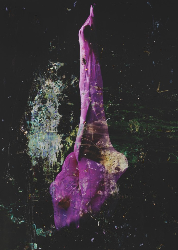
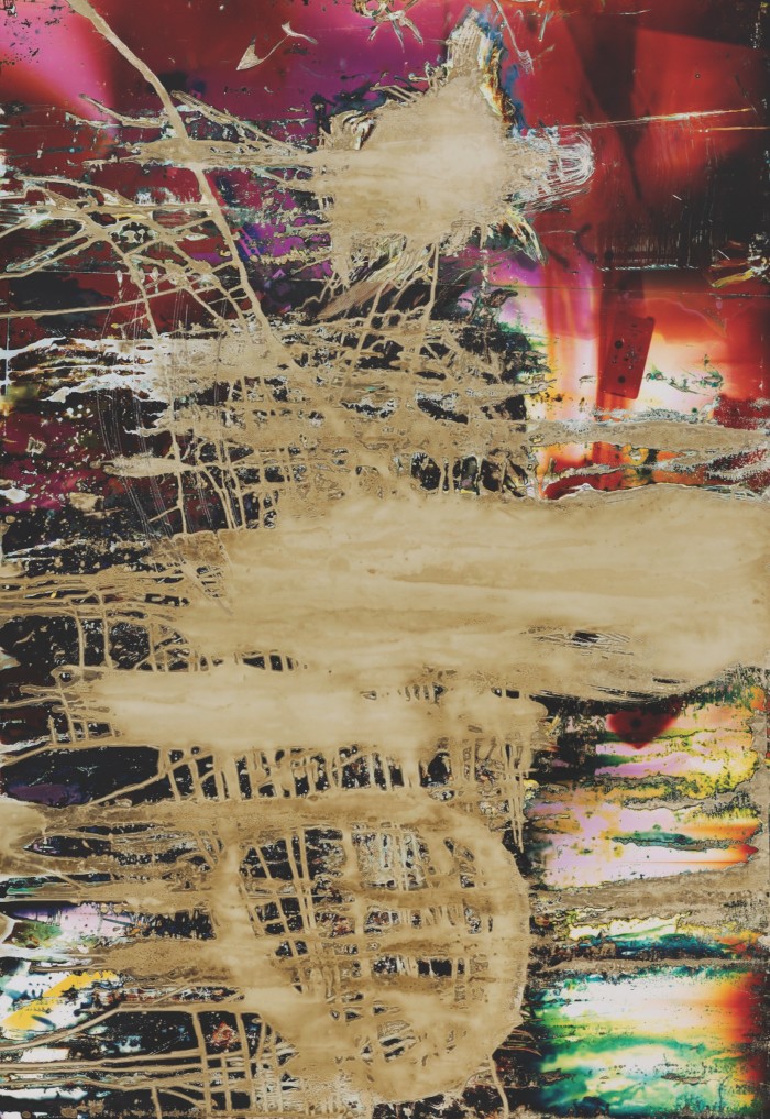
This month, the organisation releases its first publication, Dive, which explores the act of diving as a metaphor for transcending through the work of four contemporary artists. A diagram delineates the progressive stages: from the “surface” represented by Sølve Sundsbø’s warped photographs of faces, down to the “depths”, captured in Harley Weir’s painterly photographs that explore the importance of “light, colour, texture” in the meditative state.
Dive is published by the David Lynch Foundation at €60, raising funds for the organisation’s charitable projects
Nicola Tanzini maps the changing landscape of tourist photography

Rome’s Colosseum, the Leaning Tower of Pisa, the temples of Tokyo – all these have long been among the most photographed places in the world. But lately they’ve been joined by a new generation of destinations. These more quotidian scenes – of housing blocks, coastlines and unlikely urban streets – have become star attractions in the age of social media, sought out by tourists as evidence of the “real” city beyond the postcard scenes.
It’s a cultural shift that the Italian street photographer Nicola Tanzini maps out in his new book, I Wanna Be an Influencer. Through his lens, we see how a zebra crossing in Tokyo or the courtyard of a traditional high-rise neighbourhood in Hong Kong, with its geometric grid of apartments, become the graphic backdrops for thousands of photographs. The images point towards both the playful and democratic nature of travel culture – as well as its more insidious side, as these neighbourhoods are reduced to “content”.
I Wanna Be an Influencer by Nicola Tanzini is published by Skira at £25
Architect Herman Ellis Dyal revisits his childhood church

Returning to his family church after a 50-year absence, architect Herman Ellis Dyal found its interiors preserved in time. Yet the church he had attended since childhood was completely altered: the once-1,000-strong congregation that had attended Sunday-morning worship and Wednesday church suppers in the ’50s had dwindled to about a dozen. Dyal began visiting the Austin, Texas church with his camera in order to document the building as it quietly deteriorated.
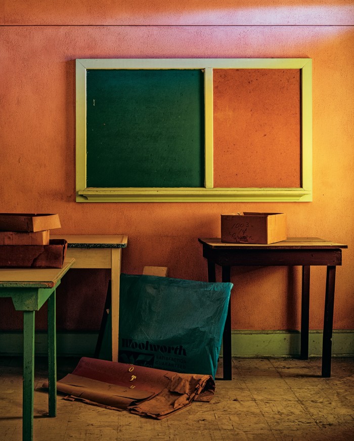

These photographs form his debut monograph, The Things Not Seen Are Eternal. Dyal, who has held positions with firms including Philip Johnson and SOM, captures the church’s fading beauty with an architect’s eye. Stained-glass windows refract dappled light onto bare walls and doors open onto more doors, giving the empty building an almost labyrinthine feel. Chalkboards bear the marks of Sunday schools past, and walls painted in rich tones of burnt sienna and stone blue are grubby with age. Together the photographs tell a story of society’s gradual secularisation, and the unnerving power of childhood memories.
The Things Not Seen Are Eternal by Herman Ellis Dyal is published by Gost at £45
Letters from M/M celebrates the work of the cult Parisian design agency
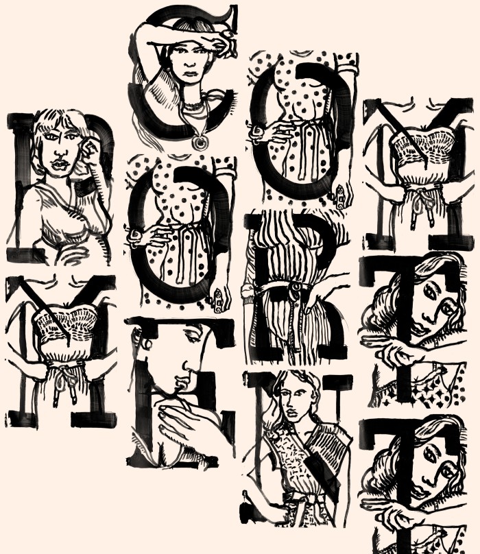
“Kinda like font-psychics,” is how Icelandic singer Björk describes M/M, the Parisian graphic design agency founded by Mathias Augustyniak and Michael Amzalag, with which she has collaborated on her album artwork for two decades. “They are the method actors of letters.” The musician’s introduction opens Letters from M/M, a new book exploring 90 of the designers’ best fonts, which range across fashion, art, theatre and music.
For Louis Vuitton’s 2014 rebrand, the agency took the house’s classic roman typeface down to its barest form before embedding “almost invisible idiosyncrasies” so that “it cannot be counterfeited”, Amzalag writes. For beauty brand Byredo, it produced a stencil typeface that sits somewhere between the handmade and the mass-produced, while for Miu Miu’s AW18 fashion show, it painted a woman dressed in different pieces from the collection for every character of the alphabet.
Letters from M/M (Paris) by Paul McNeil is published by Thames & Hudson at $50
Comments