Add this topic to your myFT Digest for news straight to your inbox
Kingdom of broken charts
🥁
One more chartache
This old chart of mine (is weak for you)
What becomes of the broken-charted?
Half the difficulty, twice the prizes
Emerging nations would benefit from raising trust in their economic statistics
Banks to the future
🎄🎄Now with even more charts! 🎄🎄
Send good email, receive t-shirt 🤝
🤓
Lines go up, lines go down . . . but what do they mean?
Covid, the Ukraine war and climate chaos make for anxious reading, so maybe it’s time to go back to numbers
Coincidence? I think NOT
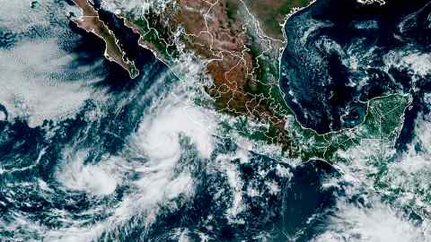
Analysts raise questions over the accuracy of latest official figures on which policymakers depend
We don’t know when. We don’t know who will get there first. But Q-day will happen — and it will change the world as we know it
The American midterms demonstrated that punditry based on ‘vibes’ has little value
Legal teams are using data visualisation to share information and spot opportunities
Better use of data brings benefits for legal practitioners, their colleagues and clients
The ‘cone of uncertainty’ and why it is misunderstood
What the data tell us about basic schooling, funding and policymakers’ priorities
Thou shalt not truncate the Y axis.
“A lesson. Explained with two charts.”
International Edition