How global income inequality has shifted since the crisis

Simply sign up to the Global Economy myFT Digest -- delivered directly to your inbox.
During and after the global financial crisis, one trend in global income inequality accelerated while another, opposing trend, appeared to stall. Between-country inequality continued to shrink, as it had been doing for decades. This makes sense: growth in advanced economies suffered a deeper and more protracted collapse than in the rest of the world, which had already been catching up quickly.

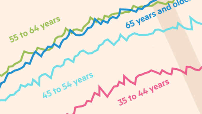
Income inequality within the typical country is a more complicated story. After a long period of rising, it seems to have reversed only slightly — and the reversal itself might well have been temporary. It is too soon to know, but it is notable that the trend applies to the world’s two biggest economies, the US and China.

As you can see in the final chart, changes in inequality throughout the crisis period also varied dramatically by country. Perhaps most striking is the contrast between the experiences of northern Europe and the periphery.

Graphics by Chris Campbell

Comments