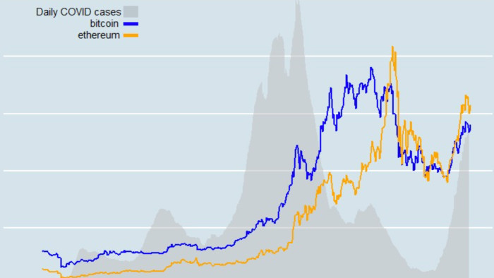
Is there a correlation between US Covid cases and crypto prices?


Roula Khalaf, Editor of the FT, selects her favourite stories in this weekly newsletter.
You might recall that back in the very early days of Covid-19 (or just “coronavirus” as it was then known), some crypto nutters enthusiasts started getting excited about the idea that the virus would be good for bitcoin because “paper money” “might be the source of #CORONAVIRUS #SARS2 infection”. After all, “fiat is dirty”:
@thebearablebull it’s time to switch to a digital currency. Fiat is dirty and is cause for the spread of the corona virus. Could this be the catalyst that advances utility of XRP???
— Michael Beck (@Michael35314117) January 25, 2020
Now, to be fair to the bitcoin bros (not great) and XRP army (worse), even the World Health Organisation had around that time started pushing the idea that Covid could be being spread by banknotes (while simultaneously recommending that people should not wear masks), now thought to be “very unlikely”. Even if banknotes were a key transmission vector, however, we are not sure that “dirty fiat” itself could be held responsible, given that the vast majority of it only exists in digital form. Why would you use bitcoin, or XRP, or any other crypto token when you can transact digitally using fiat currencies?
Yet in some ways, the crypto crowd were not wrong. In the almost 18 months since Covid-19 was declared a pandemic, the price of bitcoin has risen by about 525 per cent, from just under $8,000 to a three-month high just above $50,000 on Monday. XRP has climbed by a similar amount to trade around the $1.25 mark.
And that, we regret to inform you, has led to some rather silly thinking (highly unusual in the crypto community, we know), specifically of the chart-crime variety:
Want to see an interesting relation?
— unusual_whales (@unusual_whales) August 22, 2021
Check the relation between COVID case numbers and $ETH, #BTC.
Numbers go up?
(Credit to @JohnWRichKid's for first noticing). pic.twitter.com/7IBTyhZ9Xb
Yes, a most “interesting relation” indeed. When Ethereum (or “ether” as the token that powers the network is called) hit its record high of just under $4,200 in early May (not of course higher than the bitcoin price at the time though you wouldn’t know that from the above), the chart shows Covid cases falling towards their lowest levels since April 2020. When bitcoin hit its record high of around $63,000 just a few weeks earlier, Covid cases had already fallen very steeply, according to the chart. And when Covid cases hit their highest levels in early January, bitcoin suffered its worst crash in eight months. It’s almost as if there is no correlation between crypto prices and Covid cases whatsoever, isn’t it? (Both crypto coins have risen in recent days, while cases have also risen; there’s not an inverse relationship either.)
It should be noted that crypto prices also started rising more quickly when Donald Trump lost the presidential election, so we should probably have a think about the notion that Trump might actually be Satoshi, and that now with more free time on his hands he is focusing on pumping the market. After all it is highly likely that he is a Japanese-trained quantum physicist (do make sure you get to 2:09 in this for proof of his knowledge of thermodynamics, and to 2:45 for evidence of his reading Japanese):
OK perhaps that’s a little far-fetched. But what is behind crypto’s crazy climb over the past 18 months, we hear you ask? We don’t mean to suggest that the pandemic hasn’t been involved, because we think it has, but not in the way that this chart criminal implies — not, in other words, because it’s some kind of safe haven that traders flock to when they are worried about Covid cases rising; the data don’t bear that idea out.
It’s always hard to know exactly what is driving crypto prices given the opacity of the market and a certain rather large player whose name rhymes with weather, but we think it’s probably partly related to the same market madness that drove GameStop to da moon, as well as to a desire for an alternative to central bank-issued money due to worries about the government overreach (by means of Covid restrictions), and also endorsements from chief executives at the likes of PayPal, Tesla and Twitter/Square.
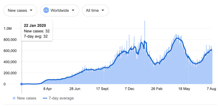
We should also point out that if we had been given labels on the Y-axis (which obviously we are not), it might become clear that these “daily Covid cases” refer to US Covid cases. Because while a US chart looks exactly like the one above, a chart showing worldwide Covid cases doesn’t; instead it looks like this (according to Google):

Perhaps a bit odd, then, to decide to chart crypto prices against US Covid cases rather than global cases, given crypto is traded globally.
Very generously our tweeter credits another crypto fanatic for the remarkable analysis, who had drawn up his own chart just days earlier:
When Covid numbers goes up, Bitcoin goes up. Based on this analysis I am issuing a BUY order on Bitcoin with a price target of $1 million by September. Attached is my analysis with the Bitcoin chart just above the Covid chart. All thoughts welcome. pic.twitter.com/AeMAEAixn9
— John W. Rich Kid (Wendy’s Fry Cook) (@JohnWRichKid) August 18, 2021
Now one can ever be sure in this “space” but we *think* given that the blue line is so vertical that it literally bends backwards, and that the guy seems to have a sense of humour in his other tweets, this is a joke. We’re not sure “@unusual_whales” got the memo, did he, oh well. Can someone please make sure someone at Citi did?
Related links:
Coronavirus is “good for bitcoin” — FT Alphaville
The many chart crimes of *that* Citi bitcoin report — FT Alphaville
Hey Citi, your bitcoin report is embarrassingly bad — FT Alphaville
Comments