These paint shades will improve your mood
Roula Khalaf, Editor of the FT, selects her favourite stories in this weekly newsletter.
Google searches for buying paint online have soared in recent months. One recent survey even suggested that more than a third of Americans have used their time in lockdown to repaint their homes, while online workshops hosted by interior designers such as Kelly Wearstler and Rita Konig have drawn huge audiences of DIY decor enthusiasts. But which interior shades will best boost your mood? These experts offer a spectrum of positivity…
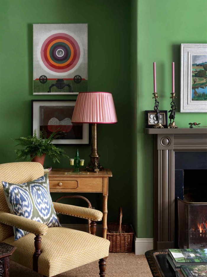
Rita Konig used Invisible Green by Edward Bulmer Natural Paints in the living room of her Teesdale farmhouse
Rita Konig, interior designer
“I love Invisible Green by Edward Bulmer Natural Paints. I first saw it in the Welsh home of decorator Jane Ormsby Gore; she has it in her sitting room, which is such a cosy and friendly room, filled with beautiful things. That space made me realise I had never met a green room I didn’t like – it reminds me of the coat worn by Babar the elephant. So when I came to work on the living room in my Teesdale farmhouse North Farm – which at first I was a little daunted by – I started with the same green.” ritakonig.com; her interior design workshop is available online at createacademy.com
Rachel Chudley, interior designer
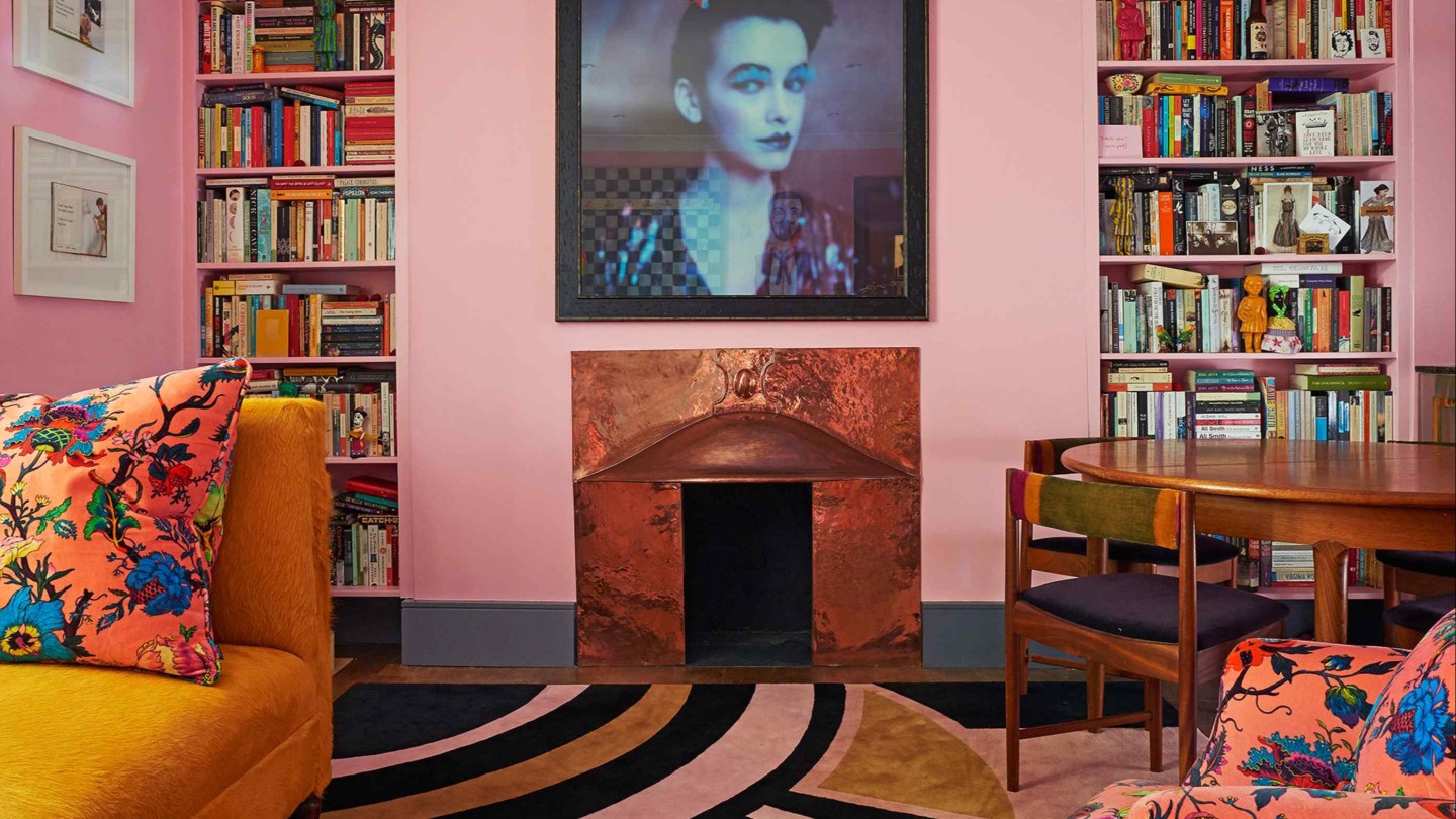
“We create bespoke colours especially for each space we work on. I work closely with master of colour Donald Kaufman, who has created the paint colours found on the walls of museums such as the Metropolitan in New York and the J Paul Getty in Los Angeles. I love the ‘acid pink’ we created for the east London home of performer and writer Rachel Snider. It matches her colourful personality.” rachelchudley.com
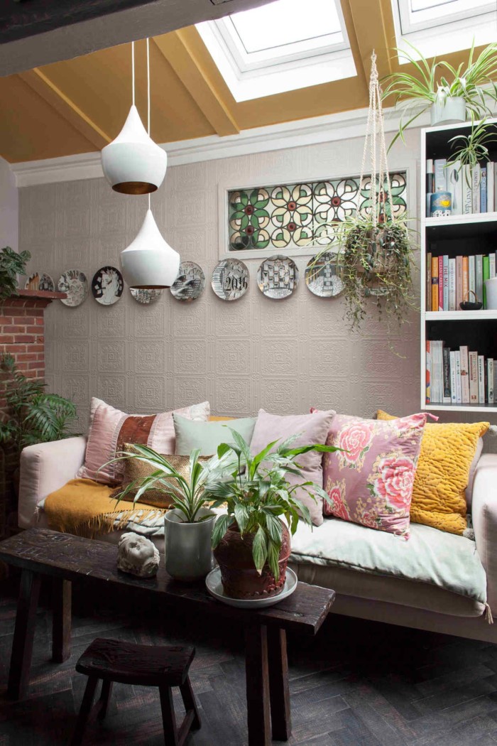
Yellow Pink by The Little Greene Paint Company features on interiors writer Michelle Ogundehin’s kitchen ceiling
Michelle Ogundehin, interiors writer
“The most recent colour addition to my home is a silky rich mustard yellow – Yellow Pink by The Little Greene Paint Company. It’s something of a change from the grey-toned lavenders, pale pinks and sea tones I’ve used elsewhere, but every good interior scheme needs a dose of the unexpected. I didn’t want to use it on my walls, though, so I put it on the ceiling in my kitchen. Its sunny warmth is so uplifting. It’s like my own mini sunroom purely through the power of paint.” michelleogundehin.com; her new book Happy Inside: How to Harness the Power of Home for Health and Happiness is out now.
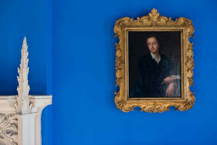
Historic-paint specialist Pedro da Costa Felgueiras used Blue Verditer in a gothic-revival villa
Pedro da Costa Felgueiras, historic-paint specialist and founder of Lacquer Studios
“Blue Verditer is one of my favourite shades. I used this pigment in two rooms at Strawberry Hill House, an 18th-century gothic-revival villa in Twickenham. The Blue Bedchamber is painted in the pigment’s purest and best form. It can produce a very beautiful, textured, deep, velvety blue.” lacquerstudios.com
Inchyra Blue: made by Farrow & Ball colour-curator Joa-Studholme for a Scottish Regency mansion
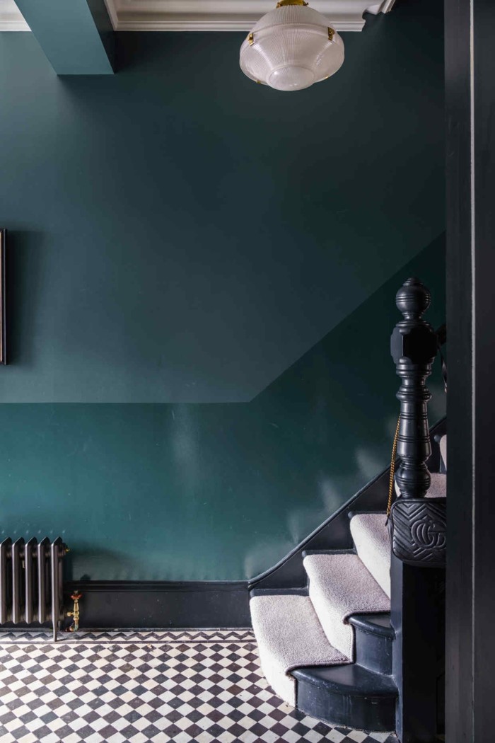
Joa Studholme, Farrow & Ball colour curator
“Inchyra Blue is a colour I made originally for Inchyra House, a Regency mansion overlooking the Ochil Hills outside Perth, Scotland. It was inspired by the moody Scottish sky and I particularly love it because it is such an ‘uncertain’ colour – sometimes it appears to be blue, sometimes green and at other times grey. I chose it for the hall to provide as much drama as possible when entering the house, as my client requested the wow factor. For an extra decorative effect, I used Full Gloss on the bottom half of the wall and the flatter Modern Emulsion above, which has the added benefit of making rooms feel big and light.” farrow-ball.com; at-home and online consultations with Studholme and other in-house colourists are £150 an hour.
TOP PAINT SHOPS
Graham Brown
This Lancashire family business is best known for its wallpapers, but its paint range reflects the soothing colours found in nature, like sky blues and meadow greens. grahambrown.com
Pure & Original
Here paints are mixed to suit each client’s space, using natural pigments and the brand’s original colour recipes. pure-original.com
Paint and Paper Library
Founded over 20 years ago in London by interior designer David Oliver, Paint and Paper Library now offers a palette of 180 hues, including Architectural Colours, designed to bring depth to neutral schemes, and Original Colours, inspired by historical interiors. paintandpaperlibrary.com
Plain English
The interiors brand has launched three colour collections in collaboration with designers Adam Bray, Sue Skeen and, most recently, Rita Konig. plainenglishdesign.co.uk
Lick
This newly launched e-store offers next-day delivery of samples, paint, wallpaper and supplies. lickhome.com
Comments