Personal style: Roksanda Ilincic

Simply sign up to the Life & Arts myFT Digest -- delivered directly to your inbox.
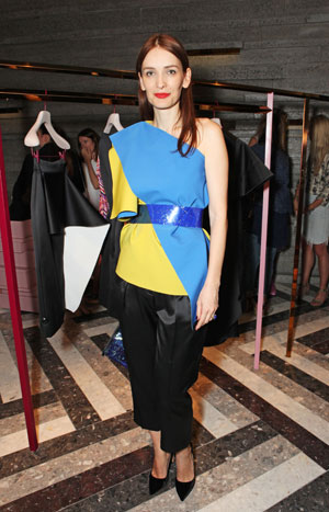
Strong colour has always been part of my design DNA. When I was starting out there weren’t many designers around using colour to the same extent, so it definitely helped me stand out and establish myself. From a sales point of view, people were scared of buying clothes in strong shades – neutral garments with bright detail were much more acceptable.
Later, however, I created a resort collection featuring dresses in fluorescent yellow. This was a big statement and lots of critics who reviewed the collection wondered if it would be a success. It became a bestseller. I think I managed to pick up on what was happening – that women were actually responding to colour and felt ready to introduce it into their wardrobes.
Now it’s acceptable to wear lots of different colours at the same time, clashing with each other as a fashion statement. I like to experiment with colour combinations and mix up colours that aren’t seen as complementing each other in a classic sense: say green and brown; orange and purple; or orange and yellow, perhaps.
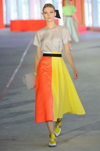
Each season has an unusual colour combination, more or less. It makes me excited. For the spring/summer 2014 I put pure bright yellow against fluorescent orange. In that particular collection I kept it quite pure, minimal, but very bold, and it had a great response – the yellow dress has sold amazingly well.
I loved Prince William’s comment [that the Duchess of Cambridge – Kate Middleton – resembled a banana in my yellow dress]. I think colour brings lightness and fun to everything, and that is what fashion should be about. The Duchess is a really great ambassador for British fashion, supporting designers a lot – we are lucky to have her.
The whole perception of colour has changed, particularly with the fashion-forward girls who feature on internet blogs and show colour in real life. It’s one thing seeing colour in a magazine and quite another when you see someone wearing it.
What really started the trend for colour was the internet and the whole technological boom, because dark dresses are not very photogenic online as you miss all the fine details. I think print has been booming over the past few years because of the internet too. Nowadays we have to design globally and think about different women in different climates who respond to colour differently. So I wouldn’t sell bright colour in Paris at all, it’s all about black and navy. If Parisian women do have an element of colour, it will be quite discreet or on a bag, for example.

On the other hand, if you go to Asia, women are much more open-minded about it and like to experiment. American women probably fall somewhere in the middle of these two but lean towards more classic colour combinations.
I usually have quite a few artists on my mood board as I design – it might be just one image or it might be 20. One to whom I would particularly dedicate my work is Josef Albers – I have done a collaboration with the Josef & Anni Albers Foundation. Josef used different and quite unusual colour combinations, and that simplicity is something I am drawn to.
In my AW14 range I gained inspiration from the American artist Mel Bochner and sculptor Jessica Stockholder, and I’ve also been inspired by Ellsworth Kelly.
Fashion design is comparable to art – there’s much more connection than people think.
Roksanda Ilincic has just opened her first store, on London’s Mount Street
‘Making Colour’ is at the National Gallery until September 7. For Jackie Wullschlager’s review see ‘Making Colour’ at the National Gallery, London’
Comments