There is nothing typical for stocks when the Fed stops raising rates

Roula Khalaf, Editor of the FT, selects her favourite stories in this weekly newsletter.
The writer is chief investment strategist at Charles Schwab
Whether the recent rate rise by the US Federal Reserve caps off the most aggressive tightening cycle in four decades is still being debated.
The CME FedWatch Tool — which tracks the probabilities of rate changes implied futures trading data — indicates that investors believe that there is about an 95 per cent likelihood of no change to rates at the June monetary policy-setting meeting of Federal Open Market Committee.
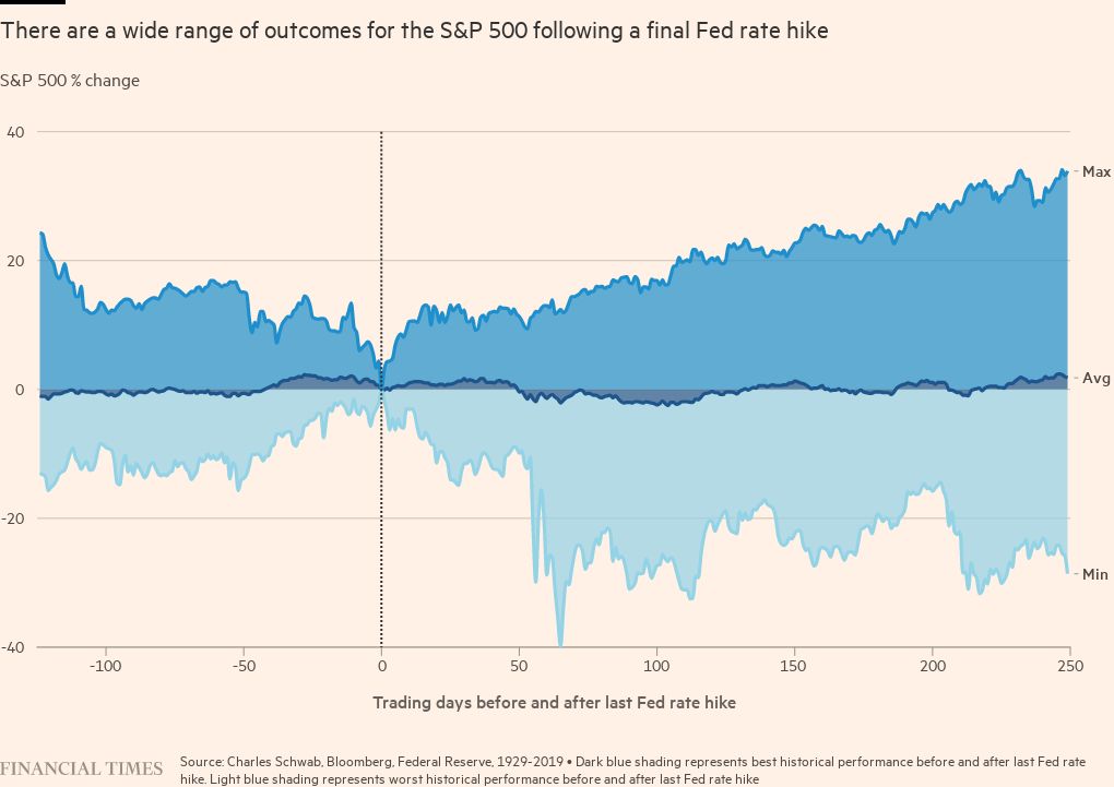
Staying with those odds for now, perhaps it’s time to dust off the “what happens when the Fed is done hiking” playbook. The problem is the playbook has had many different (and diverging) chapters over the history of rate rise cycles. Be mindful of the fact that the sample size is relatively small at 14 main rate rise cycles since the S&P 500’s inception in 1928. That suggests caution around thinking there is a consistent pattern to apply to investment decision making.
It is indeed possible to construct an average trajectory of the S&P 500 from six months before the final rate rise of each main cycle out to the following year. Focusing only on the average would suggest a pattern of weakness leading into the final rise, some strength in the immediate aftermath, and then a significant sell-off out to about 100 trading days after the final rise. Shame on anyone though who begins and ends the analysis with these generalities.
Why? Consider the extraordinarily wide range of outcomes in the 14 cycles — generally in the range of a rise of 30 per cent to a fall of the same scale over the span of the 12 months following the final rate rise.
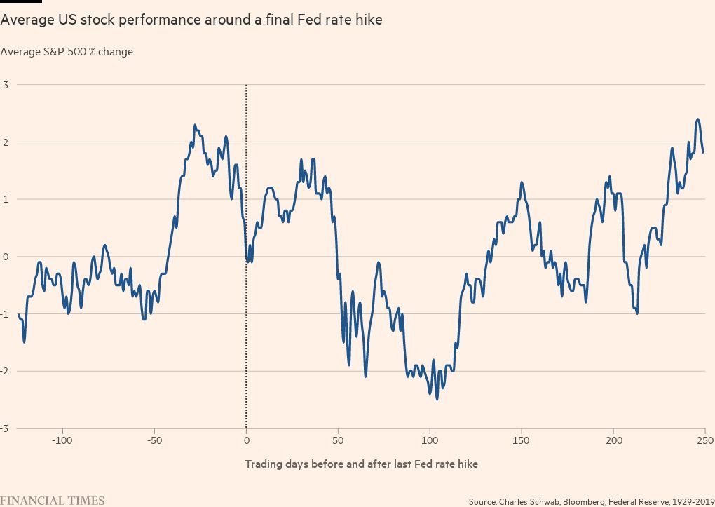
There is not much of a pattern between the date of the final rise and the S&P 500 performance at the six-month and one-year point. Likewise, the span between the final rise and the subsequent first rate cut. This highlights that there are always myriad influences on market behaviour — not just monetary policy. But it also reinforces one of my favourite adages: Analysis of an average can lead to average analysis.
In the immediate aftermath of the Fed’s announcement in early-May, I saw several headlines that flashed something along the lines of, “typically, the final rate hike has been a positive for stocks”.
The problem is that there is no “typical” when it comes to this analysis. In fact, the pattern associated with the average trajectory of stocks actually never occurred during any individual cycle!
This rate rise cycle has already been particularly unique relative to the past three cycles. Last year, stocks got crushed during the first six months of the rise cycle; in contrast to the previous three main rise cycles (2015-2018, 2004-2006, and 1999-2000), when stocks rallied during the rising phases.
Yes, there were winning years following the final rate rise, including 1995, 2018 and 2006. In the case of 1995, when stocks rallied 32 per cent after the final Fed rate rise, it was partly tied to the historical rarity of an economic soft-landing; but it was also in the midst of the secular bull market from 1982 to 2000.
In 2018, the Fed was able to pivot to rate cuts; but unlike now, it was not battling a 40-year high in inflation. Stocks performed well following the final rate rise in 2006, gaining 16 per cent one year after the last rate rise; but as we all know from painful experience, it was a reprieve only be squashed by the global financial crisis.
In fact, the stock market peaked in less than a month following the first rate cut in September 2007. This was also in the midst of the secular bear market from 2000 to 2009.
Then there were the deleterious paths stocks took following the Fed’s final rate rise in 1929, and to a lesser degree following the final rise in 2000. Stocks were down 28 per cent after 1929’s last rate rise and 15 per cent after 2000’s pause.
The cycles don’t represent proxies for the current environment — with 1929 marking the start of the Great Depression, and 2000 marking the onset of the bursting of the tech stock bubble. Both also represented commencements of the secular bear markets between 1929 to 1942, and 2000 to 2009, respectively.
The hoped-for end to the Fed’s most aggressive monetary tightening campaign in four decades may be in sight. But commensurate assumptions about it representing a clearing the skies of additional risk may be too complacent. In this anything-but-typical cycle, be wary of “typical” commentary when it comes to market behaviour.

Comments